Enterprise, b2b system
RAUL
The RAUL Design System is RealPage's enterprise design system. It supports complex workflows while allowing customization to meet specific business needs, enabling seamless integration, compliance, and long-term maintainability.
Clear documentation and governance structures enable teams to adopt and implement the system effectively while maintaining compliance with industry regulations
Impact
Refreshing the design system boosts efficiency, reduces costs, and improves product quality. Teams work faster and more consistently—accelerating time to market while cutting down on design and development overhead. Improvements to accessibility, scalability, and usability ensure the system grows with the business.
What are the perks?

Designed for
Desktop and Mobile
Iris has been developed in Vue and Flutter to allow the capabilities across desktop and mobile applications. This helps keeps consistency across two different code systems and allows for scalability.
Fully Accessible
for All Types of Users
Each component has been developed with accessibility in mind out of the box. Each component makes sure that it is accessible for color contrast, HTML structure, ARIA roles/attributes and screen readers.

Thoroughly Documented
Each component has been documented for designers and developers to understand the structure of each component. Design patterns, do's and don'ts and behavior use cases are described for each component.
The Audit
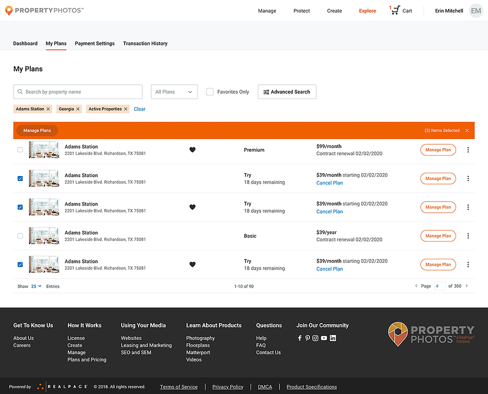
The RAUL design system was unorganized and had very little standards when it came to how designers and developers should be using the system. There was no cohesive design across products due to designers being in pods across the company.
A handful of designers moved into a design systems team and leaders started to evaluate the system to see what improvements could be done. The design system team evaluated the system, updated components, wrote new detailed documentation and delivered to engineering to develop. This required many conversations and QA sessions with design and development to align.
1. Not Flexible for Responsive
An audit was conducted to assess the design system’s ability to support responsive layouts across breakpoints and device types. The review identified gaps in layout flexibility, component behavior, and scalability—particularly on mobile and tablet screens.
2. Accessibility Gaps
An accessibility audit was conducted to identify and address gaps in the design system’s ability to support inclusive, WCAG-compliant experiences. The review covered core components, tokens, and documentation, using a combination of automated tools and manual testing.
3. No Design Standards
There were no patterns, standards or templates being used within the design team. All designers were doing whatever they wanted when it came to UX and the inconsistency in the platform showed.
The Foundation
A well-structured design system ensures consistency, scalability, and efficiency by establishing strong foundations, reusable components, and clear documentation. Adoption and governance drive its success, while continuous iteration keeps it adaptable to evolving needs. By prioritizing accessibility and maintainability, a design system enhances user experience and streamlines development for long-term growth.

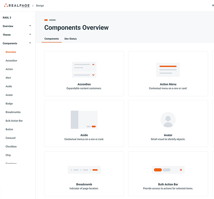
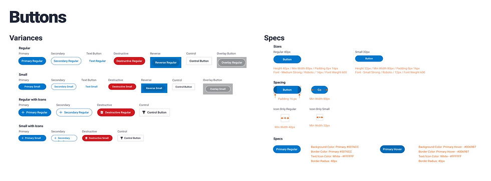
Component Documentation
The foundation of a design system ensures consistency and scalability by defining key principles, guidelines, and reusable patterns. This includes setting standards for typography, colors, spacing, and iconography. These core elements create a strong base for building accessible and cohesive components across the system.
-
Component overview: What it is and when to use it
-
Usage guidelines: Best practices, do’s and don’ts
-
Anatomy: Breakdown of structure and customizable elements
-
States and variants: Default, hover, focus, disabled, etc.
-
Accessibility notes: ARIA attributes, keyboard behavior, and WCAG alignment
-
Code snippets & implementation details: For developer handoff
-
Visual examples: Screenshots or Figma embeds to show correct usage
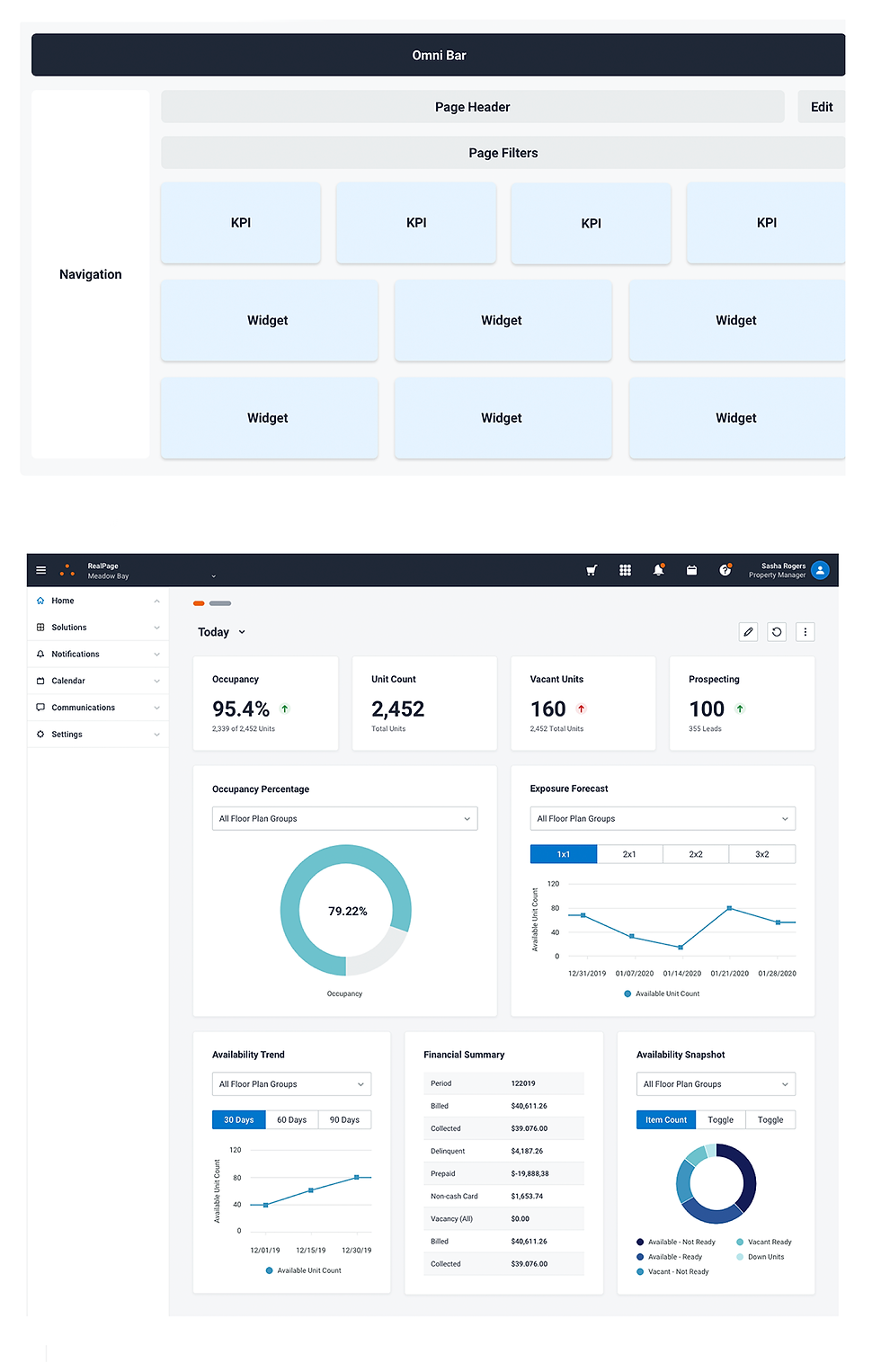
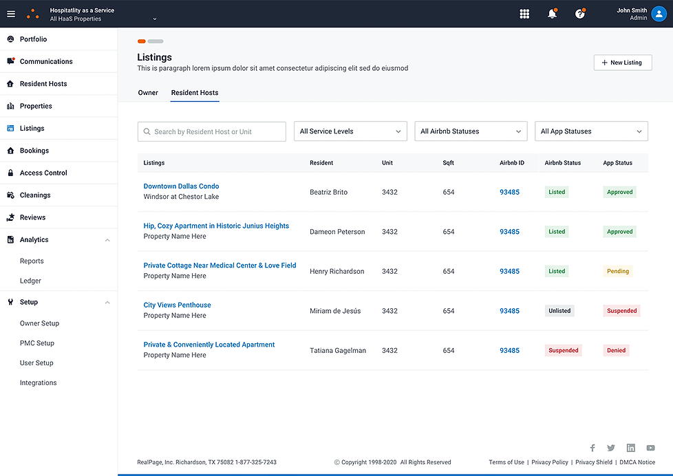
Reuseable Patterns
Reusable patterns are common interaction and layout solutions that can be applied consistently across products to solve recurring design problems. Unlike single components, patterns group multiple elements to form higher-level experiences—such as form layouts, card groups, navigation flows, or error handling.
These patterns are designed to be flexible, accessible, and aligned with brand and UX standards. By reusing them, teams can move faster, reduce inconsistency, and maintain a unified user experience.
Well-documented reusable patterns also promote best practices, reduce decision fatigue, and make it easier for cross-functional teams to collaborate and build at scale.
Development QA Process
The development QA (Quality Assurance) process ensures that components and UI implementations meet design, functionality, and accessibility standards before they are released. It serves as a final checkpoint to catch inconsistencies, bugs, and deviations from the design system.
QA helps uphold quality, improves user trust, and reduces costly fixes post-launch—making it a key step in building scalable, polished digital experiences.
The process included:
-
Visual review: Verifying alignment with design specs (spacing, typography, color, responsiveness)
-
Functional testing: Ensuring interactive elements behave as expected (hover states, modals, form validation)
-
Accessibility checks: Testing keyboard navigation, screen reader support, focus management, and color contrast
-
Cross-browser/device testing: Confirming consistent behavior across major browsers and screen sizes
-
Code and component validation: Reviewing use of system tokens, correct component usage, and clean markup
The Outcome & Business Goal
Redesigning the design system with modern security practices and elevated design standards delivers both technical and strategic benefits. The goal is to create a future-proof foundation that supports business growth, enhances user trust, and drives operational efficiency.
Updated code aligns with modern security practices, reducing vulnerabilities and supporting regulatory compliance. Enhanced documentation, reusable patterns, and accessible components reduce design and development time. Refined design standards promote a cohesive and intuitive UI across products, increasing customer satisfaction. WCAG-compliant components improve usability and reduce legal and reputational risk.

